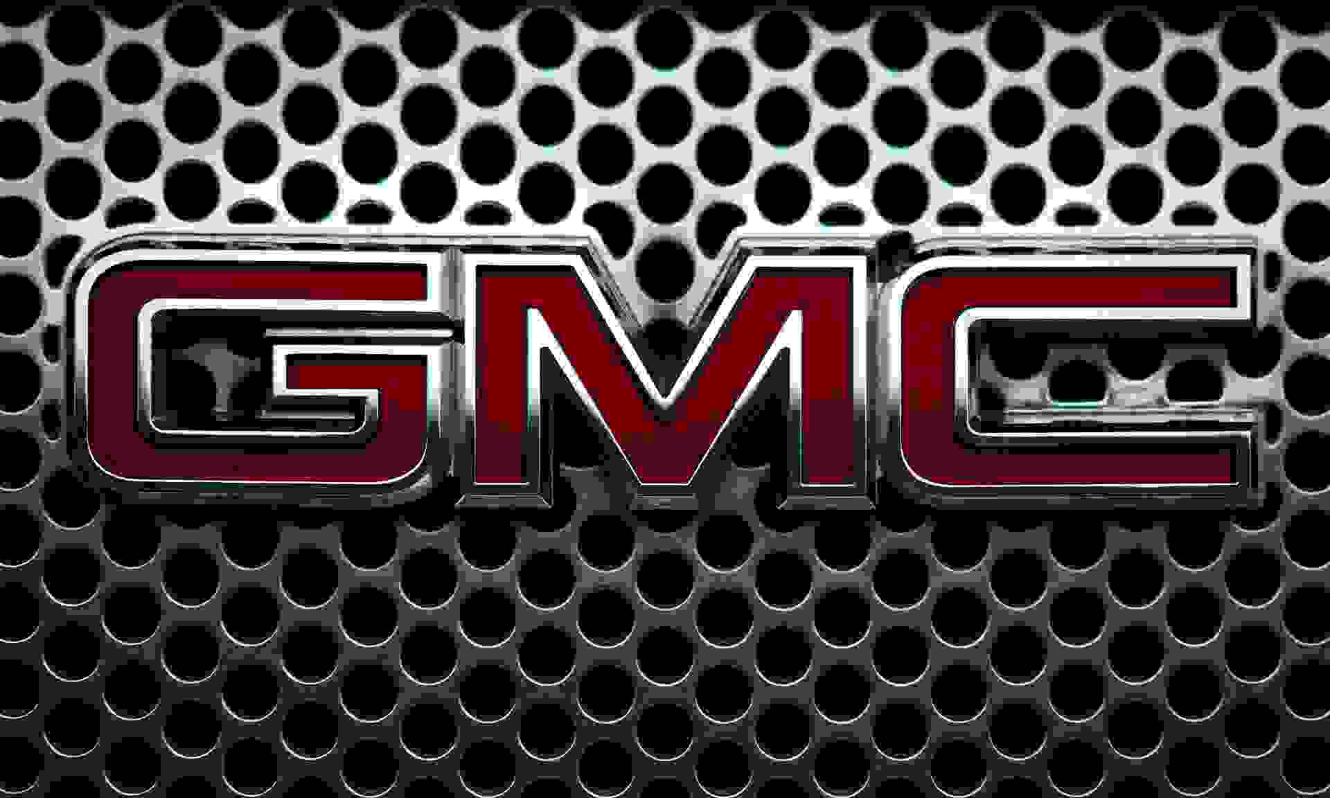
The GMC logo might be one of the simplest in the automotive industry, but it’s also one of the most recognizable. It hasn’t always looked like the capital G, M, and C in block font that we see today, though. Here’s how the GMC logo has evolved over the years.
GMC
trucks, SUVs, and vans are known for their raw utility. And the automaker’s logo—with its brazenly large, bright red, bold, imposing font—is quick to evoke an image of its reliable, powerful vehicles.Want to know more about how GMC came up with its logo and the inspiration behind its design? Let's take a look at GMC's logo history.
Compare insurance quotes from 50+ carriers with Jerry in under 45 seconds
Compare insurance quotes from 50+ carriers with Jerry in under 45 seconds
 4.7/5 rating on the App Store | Trusted by 5+ million customers and 7 million cars
4.7/5 app rating | Trusted by 5M+ drivers History of the GMC logo
The story of GMC actually begins with a company called the Rapid Motor Vehicle Company. Founded in 1902 by Max and Morris Grabowsky, it became famous for its “one-ton truck” and remained successful until it merged with General Motors in 1911 to form the GMC division.
The first GMC logo appeared in 1912 at the New York Auto Show, although it is said that these early vehicles were most likely Rapid trucks manufactured under the GMC name. But over the next few decades, GMC would evolve its vehicle designs to produce powerful models of its own, including trucks used by the military in World War I and World War II.
GMC began focusing its efforts on commercial vehicles in the 1950s with the production of heavy-duty diesel tractor models and medium-duty cabs. By the 1980s, they were manufacturing everything from minivans and small buses to trucks and SUVs.
Earning a reputation for long-standing designs, some classic GMC models like the Yukon
and the Sierra
have been updated and redesigned every year since they were first introduced in the 1990s. Fun Fact GMC used to manufacture heavy-duty vehicles like ambulances, motor homes, and fire trucks through the mid-20th century.
GMC logo changes through time
The large, bold, lettering of GMC’s modern logo might be one of the first things that comes to mind when you think of the brand, but the logo was actually redesigned five times between 1912 and the present.
Here’s what it looked like through the years:
1912: The first logo was a two-ring circle with “GMC” written in italics inside the inner ring and “General Motors Trucks” printed on the outer ring. The inner circle was black with white and orange lettering, and the outer circle was orange with black and white lettering.
1947: The first version of the logo with emphasized lettering, “GMC” appears at the top with the “M” merging into a line that runs under the brand name. The word “Trucks” is written in all caps under the line in a smaller typeface. The whole logo is bright red.
1960: The logo was shortened to include just “GMC” written in silver on a black, rectangular background.
1966: “GMC” was changed from silver to red, blocky letters with a thick black outline and silver edges. The rectangular background was removed.
2014: This logo looked almost identical to the 1966 version with the addition of some minor changes. The vertical parts of the letters were made thicker, the shade of red became slightly darker, and a linear gradient was added below the middle of each letter.

Get rewarded for safe driving. Earn points and unlock benefits. Totally free.
Start earning nowWhat’s behind the GMC logo design?
GMC’s logo might be simple red lettering at its core, but some key elements make it memorable.
The font: Massive letters spanning the length of a truck’s grille suggest the harsh and powerful nature of GMC vehicles.
The color: The modern version of the logo originally had silver letters, but the design was later changed to an attention-grabbing bright red and then to the burgundy we see today.
Fun Fact GMC is General Motors’ third-largest brand worldwide (after Chevrolet and Buick), but it’s GM’s second-highest selling brand in the United States.
How to save money on car insurance for your GMC
Did you know that more than 60% of Americans pay too much for car insurance
? But getting a lower rate for your GMC policy is easy if you shop with Jerry
. Just download the trustworthy super app
to get a comprehensive cross-analysis of the best policies across providers. When you see one that you like, just give it a tap and Jerry will handle the phone calls, paperwork, and renewals for your top pick so that you don’t have to. They can even help cancel your old policy! Have a question about your coverage? Jerry’s friendly agents are happy to help provide advice on the best coverage options. As your life changes, your insurance changes, and Jerry is ready to make those adjustments for you.
“Jerry
was easy to use, and they saved me a lot of money on my truck. I would definitely recommend them.” —Johannes T.
4.717k Ratings 5M+Drivers Joined
7M+Cars Garaged