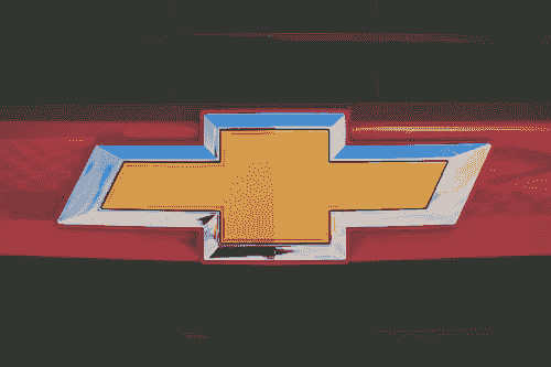
From 1911 to the present day, Chevrolet’s easily identifiable logo has seen many different iterations, and its “bowtie” shape has been present in almost every version since 1913. That said, there’s some controversy regarding exactly what actually inspired Chevy co-founder William Durant’s logo design.
Logos have been an important aspect of vehicle branding since the early 1900s when companies started mass-manufacturing motor vehicles. Nowadays, a logo is a stamp of identity and pride that bears the history that made a brand what it is.
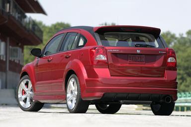
Other than its original logo, which featured the name Chevrolet written in marginally-legible cursive, the bowtie logo—spotted on vehicles like the Malibu
and Cruze—has lasted throughout the entirety of Chevrolet’s history—with a few color and typeface changes along the way. We've hopped into the way-back machine to give you a brief history of Chevrolet’s iconic logo, including its many iterations.
Compare insurance quotes from 50+ carriers with Jerry in under 45 seconds
Compare insurance quotes from 50+ carriers with Jerry in under 45 seconds
 4.7/5 rating on the App Store | Trusted by 5+ million customers and 7 million cars
4.7/5 app rating | Trusted by 5M+ drivers History of the Chevrolet logo
The legendary automotive tycoon William C. Durant—at the time the ousted founder of General Motors—co-founded the Chevrolet Motor Car Company with race car legend Louis Chevrolet. Chevrolet’s handwritten signature would become the company’s first logo in 1911, but it only ever appeared on a single prototype before being replaced with the first iteration of the classic bowtie logo.
There’s some mystery and controversy as to where the idea for the logo actually came from. Many who knew William C. Durant insisted that he said it was the wallpaper of a Paris hotel room that influenced the idea for the logo’s shape.
Durant’s daughter recalls in her biography My Father that he created the logo by drawing on a napkin during a family dinner, while his wife insists that he got the idea from a Virginia newspaper during a 1912 Hot Springs vacation.
This testimony inspired researcher Ken Kaufmann to find a logo resembling Chevy’s in a newspaper from that time, and his study led him to an ad for “Coalettes,” which, sure enough is strikingly similar to the new Chevrolet logo that came out around the same time that the Coalettes ads were running. Coincidence? We may never know.
Still, some commenters have suggest that the bowtie is a reference to the Swiss flag, seeing as Chevrolet himself was born in Switzerland. Not to mention that the company’s logo from 1950-1964 looks undeniably like the Swiss flag, except with the bowtie logo and company name in place of the federal cross. We can speculate all we want, but the true origin will likely remain a mystery.
Ford logo changes through time
The bowtie has been part of Chevrolet’s logo ever since it was first introduced, but some notable changes have been made over the years.
1914: The first bowtie was blue with gold borders around the edges and letters, with “Chevrolet” written in a white capital typeface, vertically bookended by two white lines.
1934: The color was traded out for monochrome black and white, and the typeface was changed to simpler, bolder font.
1940: The blue returned, along with the gold border around the edge of the bowtie, but the white typeface and bottom and top lines remained the same as in the previous version.
1950: Chevy went full-Swiss with the logo, surrounding a white bowtie with a red rectangle with rounded edges and red typeface in the bowtie. The two lines above and below the name also left, never to return.
1964: The simplest version of the logo simply featured a black-outlined bowtie with black, italicized typeface inside.
1976: Chevrolet went back to blue and white, de-italicizing the more compact typeface that only occupied the center of the logo.
1988 to present: Since ‘88, the wordmark has been removed from the bowtie emblem. It’s colors have been altered from blue, to silver, to red, and finally to the silver-bordered, 3-dimensionalized gold emblem that remains to this day

Get rewarded for safe driving. Earn points and unlock benefits. Totally free.
Start earning nowHow to save money on car insurance for your Chevy
Any Chevy driver knows and appreciates affordable quality, which is the name of the game when it comes to using Jerry
to shop for car insurance
. Jerry is making history just like William C. Durant and Louis Chevrolet by giving you easy access to comparable and competitive quotes from the country’s top insurers, customized to your driving profile and insurance needs.
All you have to do is download the trustworthy super app,
answer a few quick questions, and watch as the savings present themselves to you! Just like the average Jerry user, you too could save over $800 a year on your car insurance! “Super cheap! Jerry
saved me over $4500 during the entire year. The money really adds up.” —D’Shawn G.
4.717k Ratings 5M+Drivers Joined
7M+Cars Garaged